ARC
Enhancing the UI and IA of ARC’s Airline Business Intelligence application.
̌
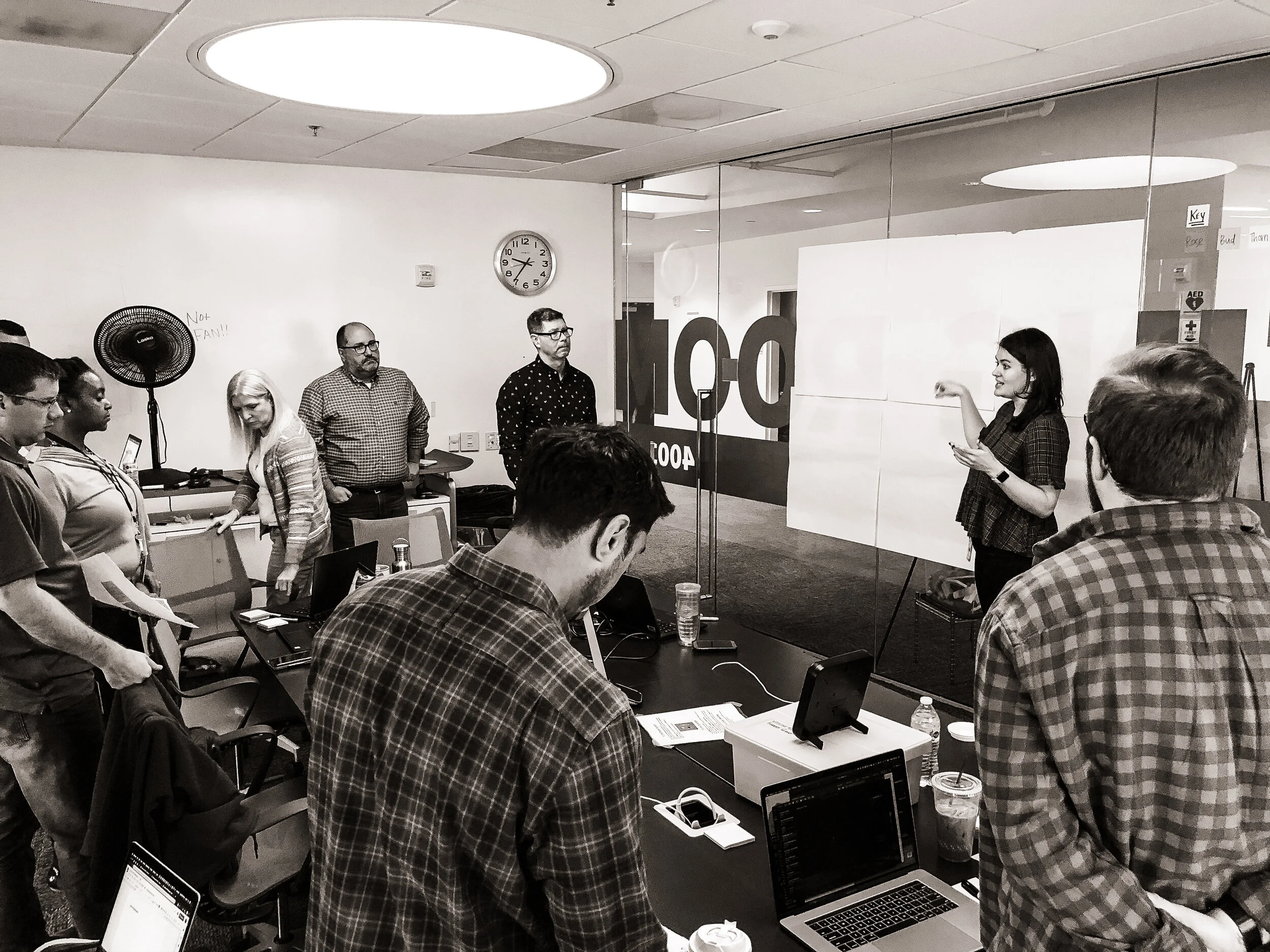
Grace leading a project kick-off workshop with ARC stakeholders at their headquarters in Arlington VA.
The Client
The Airline Reporting Corporation (ARC) is a Fortune 500 data company that provides financial services to small/mid sized airlines and agencies so they can process transactions, reduce risk, and address fraud. Their clients also receive key sales and airline ticketing data trends through their business intelligence applications.
The Challenge
ARC came to Forest Giant hoping to reimagine the user experience for many of their products and services. I was the UX Lead on the team that took on Airline BI, their business intelligence product for small/mid sized Airlines. We were tasked with updating the UI of Airline BI and compiling user insights for their sales team. Other team members included a Project Manager and a UI Designer.
The Outcome
Over the 8 week duration of the project, we interviewed 4 ARC subject matter experts and 5 ARC customers. A heuristic review of the existing Airline BI was also completed. Data in tow, we created personas, compiled user insights, updated the UI, and created a backlog for their internal product team.
Problem + Heuristic Review
Airline BI had so much information to offer its users, but it was riddled with usability and accessibility problems.
Airline BI’s original “Overview” view, showing high level sales data for a small airline.
Airline BI’s original “Agency Share” view, comparing a small airline’s sales with various travel agencies against their competitors.
The minute we got out hands on Airline BI we conducted a heuristic review. There were a lot of usability issues and errors cataloged for the client. The problems we decided to tackle during our sprint were:
RESPONSIVE DESIGN
The former Airline BI was not responsive. On almost every page the navigation modal was pushed off screen because of the varying widths - you had to scroll horizontally right every time you wanted to use it.
ERROR PREVENTION
The application had no error prevention or error messaging. Users struggled to understand which filters could be used congruently, if they made a mistake they had no idea what was done or how to correct it.
RECOGNITION/RECALL
A lot of important data and context was hidden in hover states that could be accessed one at a time. This required users to remember, but the average person can only keep roughly 7 items in their working memory.
VISIBILITY OF SYSTEM STATUS
Many filters were missing titles/context for how the filter would affect the page. The application lacked any reference for place, like bread crumbs. For an app that’s sole purpose was to let users parse through large data sets, it was pretty difficult to understand where you were and what had been done.
Research
“Theres a lot of information in this tool, I know there is. I just don’t know how to access it. It would take forever, and I don’t have that kind of time.”
I recruited, scheduled, planned, and conducted remote SME interviews with 3 Airline BI sales leads and the Airline Bi product owner.
Remote user interviews were also conducted with 4 Airline BI users. The second half of the user interview was a structured “walkthrough.” Users shows me the app functionality they found most valuable for their work, and pointed out the most frustrating features.
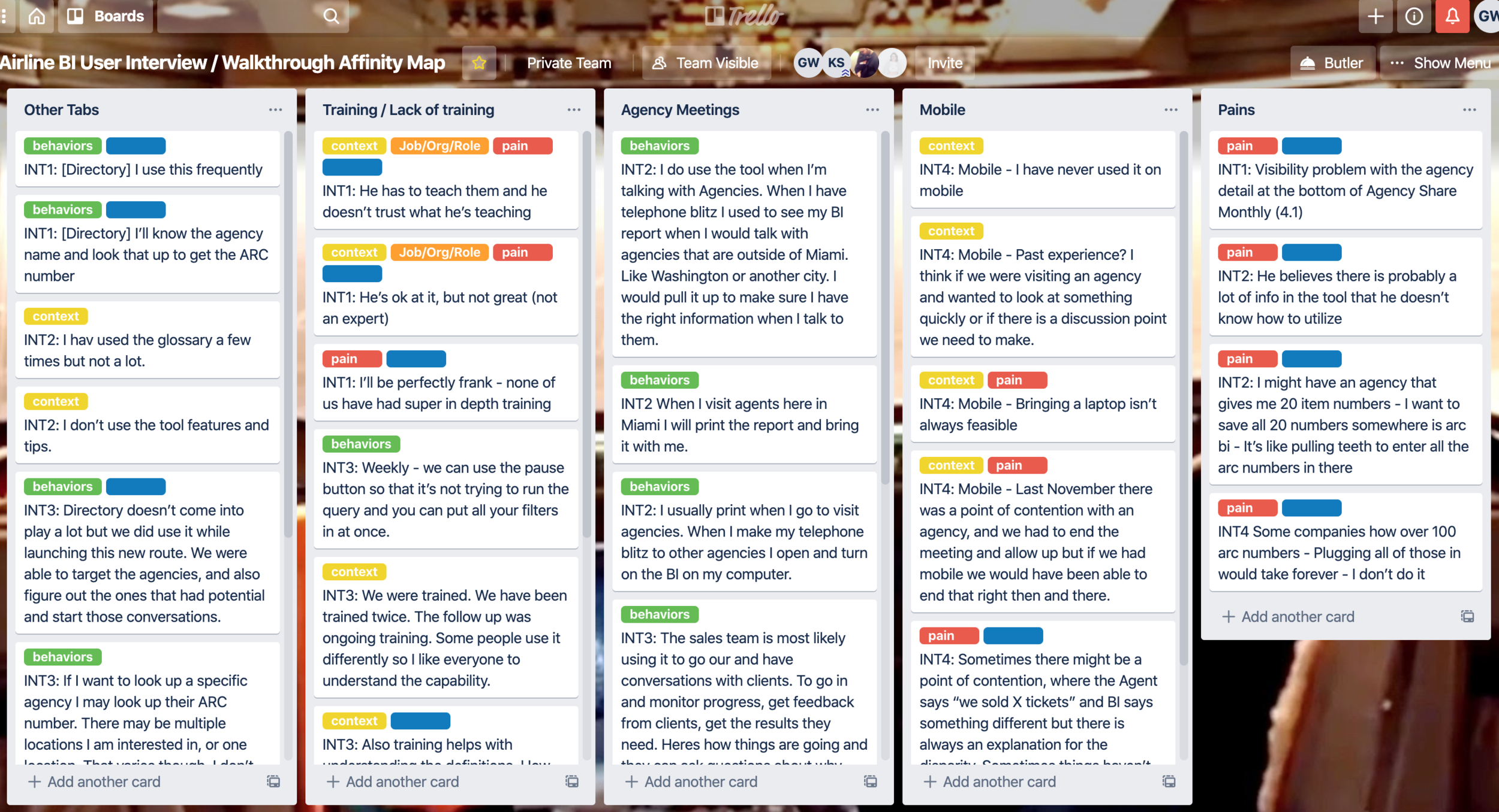
I utilized Trello for data analysis. I started with affinity mapping, coded my data in order to create themes, and then ultimately attached those insights to the proto-personas. The client also received a summary document of all the themes, but it’s long and boring so I didn’t include it in this case study.
Once all the data was compiled I was able to make a primary (Fiona) and secondary (Harry) proto-persona for the Airline BI team.
The primary proto-persona I created for the Airline BI team - Fiona, a Frontline Sales Manager at a GSA (general sales agent) or small airline.
The secondary proto-persona I created for the Airline BI team - Harry, Head of Sales for North American at a GSA (general sales agent) or small airline.
DESIGN
How might we enhance the usability and accessibility of Airline BI?
Heuristic review and interview data in tow, we began addressing some of the most egregious usability issues in the app. Our goals were to:
Make the app responsive.
Make the fonts more legible, accessible.
Utilize ARC’s brand colors and remove inaccessible color treatments in the navigation.
Introduce error prevention and messaging.
Give users a better sense of place in the app.
Remove hover states if possible.
Deactivate filters that could not be used congruently.
Initial drafts were designed using Sketch, but since Airline BI was built in Tableau we paired with ARC developers to make the enhancements directly in Tableau after that first pass.
Our first pass at the Airline BI “Overview” view. Due to the time constraints on the project we jumped right into high fidelity design work after our research phase.
Our first pass at the “Agency Share” view in Airline BI.
SOLUTION
A beautiful, functional upgrade that empowers the BI team and their customers to get information they need and trust.
Over 8 weeks of discovery, design, and implementation my team solved countless usability problems and gave the Airline BI team the foundation they needed to continue growing and building trust with their current and future customers.
Our final, implemented view for the “Agency Share” tab of Airline BI.
The reimagined “Bi-Directional” Tool, featuring error prevention without leaning on confusing, inaccessible color schemes.
We introduced “Zoom level” so that users had better control over the data they interacted with.
We were able to eliminate the need for invisible “hover” buttons. Here, it was replaced by a drop-down.
REFLECTIONS
I learned SO much about designing for large data sets over these 8 weeks. A lot of the UX/UI best practices I typically lean during projects weren’t relevant in this space - it was all about organizing the data people needed to see and presenting it in a way that helped them make the comparisons they needed to make. Things that normally would strike me as crowded or busy were exactly what these users needed. Learning and then operating by this new standard was a big adjustment for myself and the team.
There are still a lot of usability & information architecture problems to dive into in future phases…
I would love to distribute an unmoderated card sort to a wider sample of the user base to get better understanding of how users organize the different types of data Airline BI offers.
Our interviews gave us a lot of insight into how users are interacting with the app, but there is still a lot to learn. I would love to do more user interviews in the future.
This app was created on an 8 week timeline, and there was no time for a user test. I would like to conduct a user test in the future and refine our design based on that feedback.


